One of the main areas that I am focusing on with the rewrite of Property Center is the user interface (UI). My goal is to remove unnecessary complexity from the UI; not only making everyday tasks faster to accomplish but also reducing the learning curve for new users. I’ve been using Balsamiq Mockups to quickly hash out ideas rather than spending valuable time doing it with html or some other slow process.
Updating the header
For example, I’ve been wanting to update the header to include a way for people to search and quickly get things done.
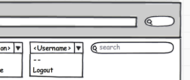
My first iteration looked like:
I still do like this layout because it puts everything in one row. My main concern is that the drop downs would confuse people who are used to using links for user settings, logging out, etc.
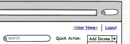
With the next iteration, I moved search and quick actions to their own row:
I think this helps simplify the structure and it uses familiar links for user settings and logging in/out.
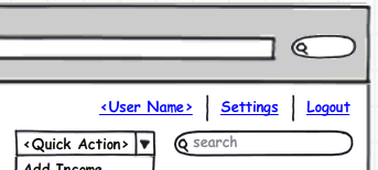
The last iteration improves on the previous by cleaning up some unnecessary labels, etc:
Overall, I think this is a good compromise of form and functionality. It gives novice users a familiar experience with links for logging in/out as well as providing a more advanced UI for those who want to perform quick actions.


